
BRANDING
SENTINEL SENTINEL
Details
01
Type of projet
School project
Role
Graphic Designer
Software used
Illustrator & html CSS
Deliverables
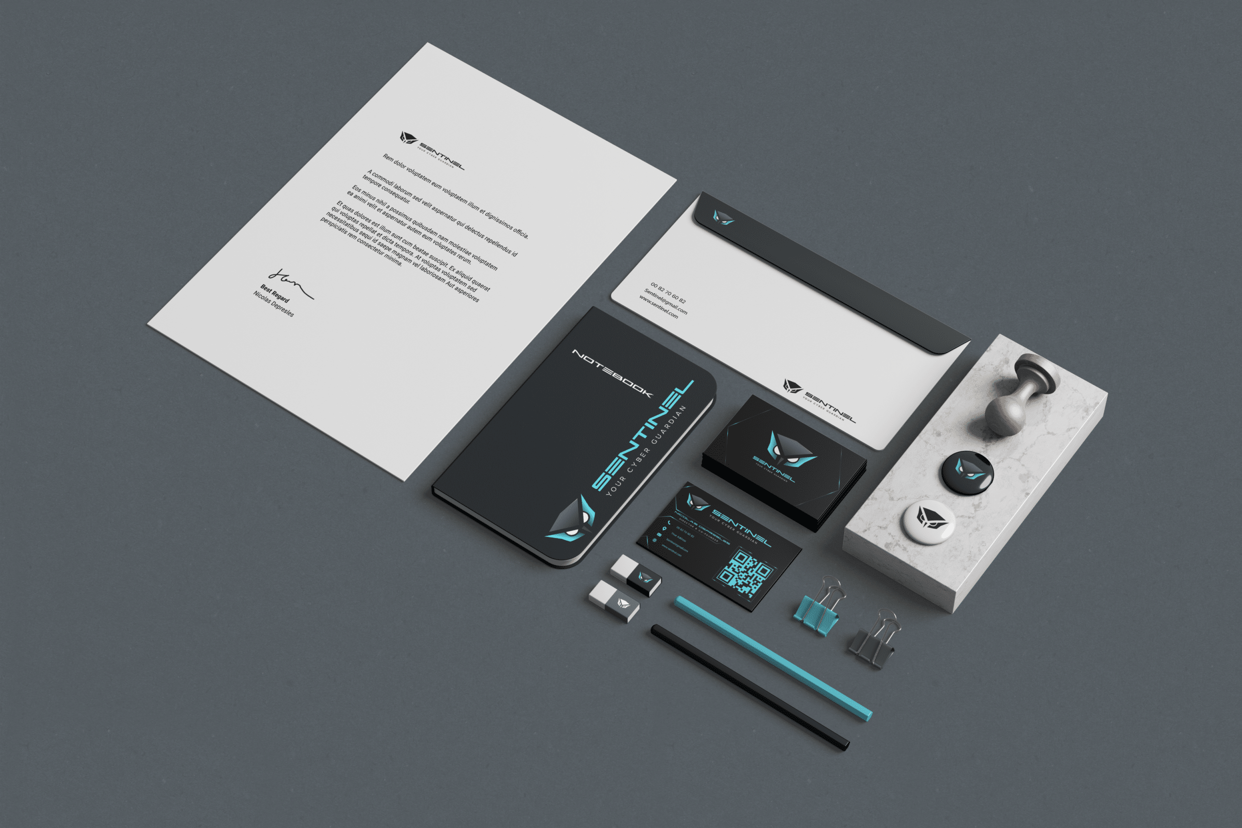
Brand indentity
Forging Digital Trust: My School Project on Crafting a Brand Identity for a Cybersecurity Company.
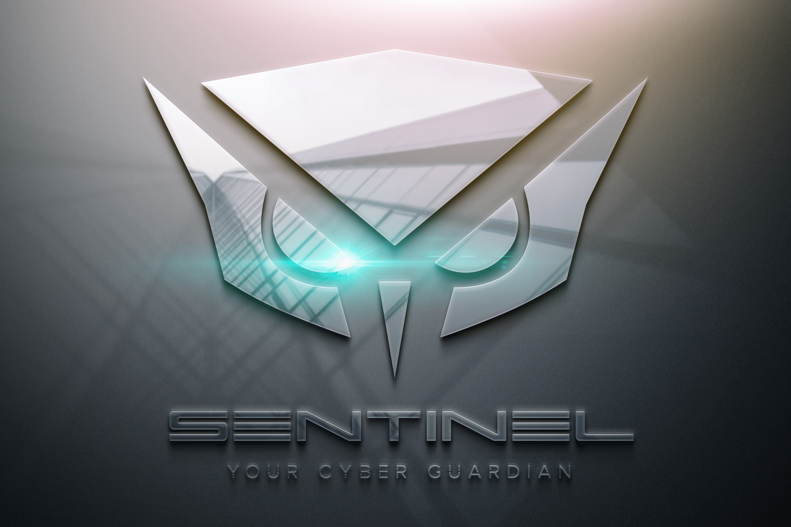
Step into the world of digital security as I present a school project that ignited my passion for brand identity creation. With a focus on a cybersecurity company, I embarked on a journey to establish a visual identity that embodies protection, innovation, and trust through careful selection of colors, typography, and design elements
Your first client wants you to create their brand identity. Define the sector, the company name, the visual guidelines, typography, business card size, and potentially the visuals.
Why an owl ?
02
Concept &
Colors
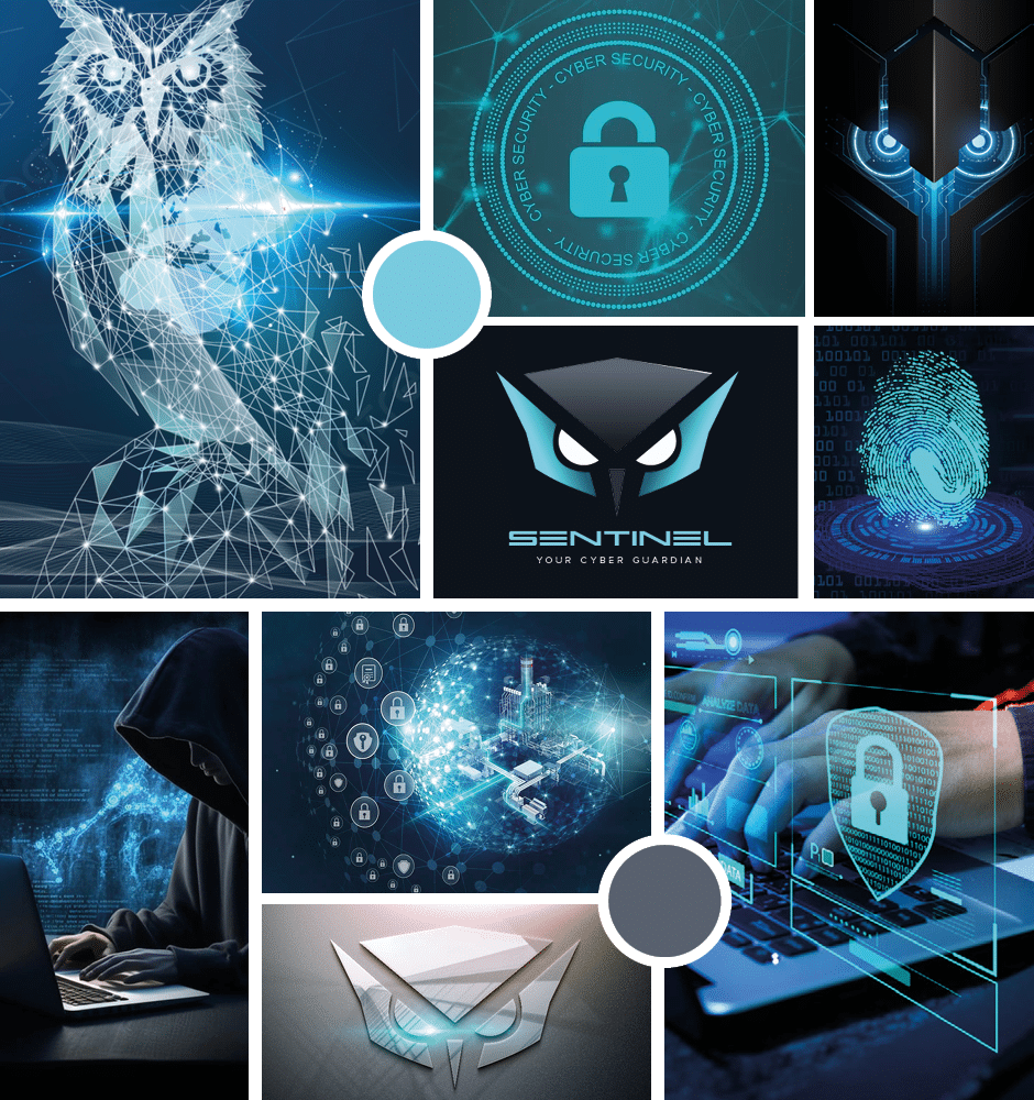
The Owl perfectly captures the essence of a cybersecurity company :
- Stealthy Protection: Like owl’s silent flight, The cybersecurity company operate discreetly.
- Guardians of the Night: Owls are night sentinels, and so are cybersecurity company.
- Detecting the Unseen: Owl’s acute perception parallels the threat detection.
To resume, owls logo stand as a symbol of trust and assurance in an ever-evolving digital landscape.
For the colors, first Blue symbolizes trust, stability, and security, fundamental principles in the cybersecurity landscape. Cyan blue also represents innovation and forward-thinking. In addition the Grey represents balance, neutrality, and professionalism.
Onepage website
03
HTML &
CSS
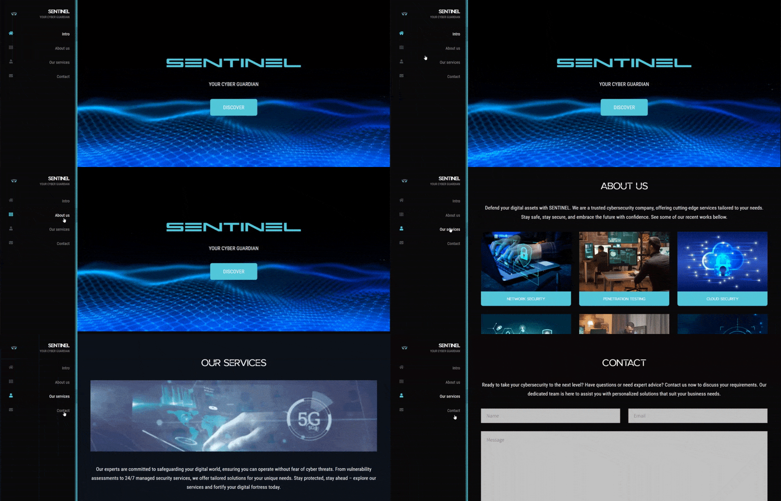
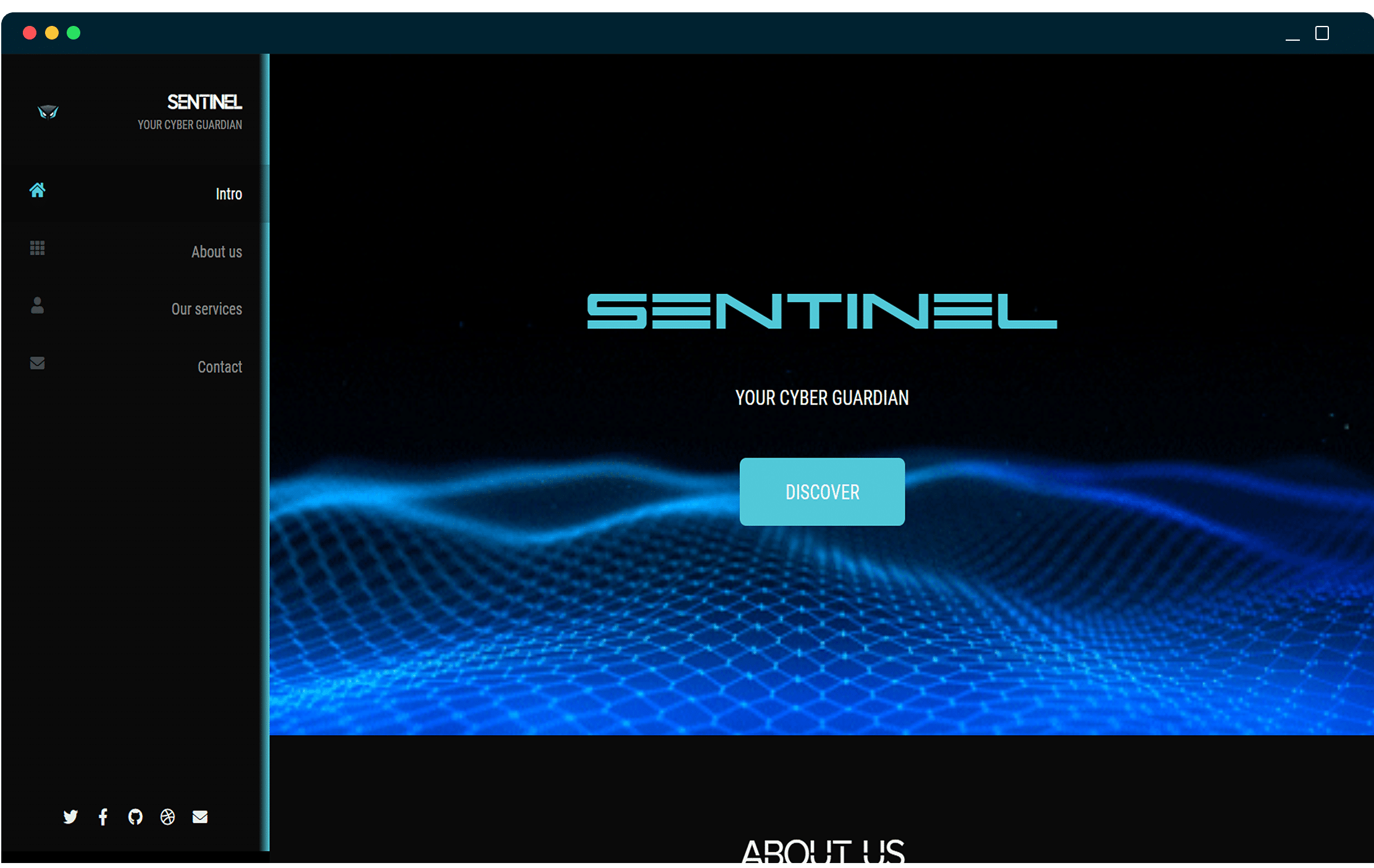
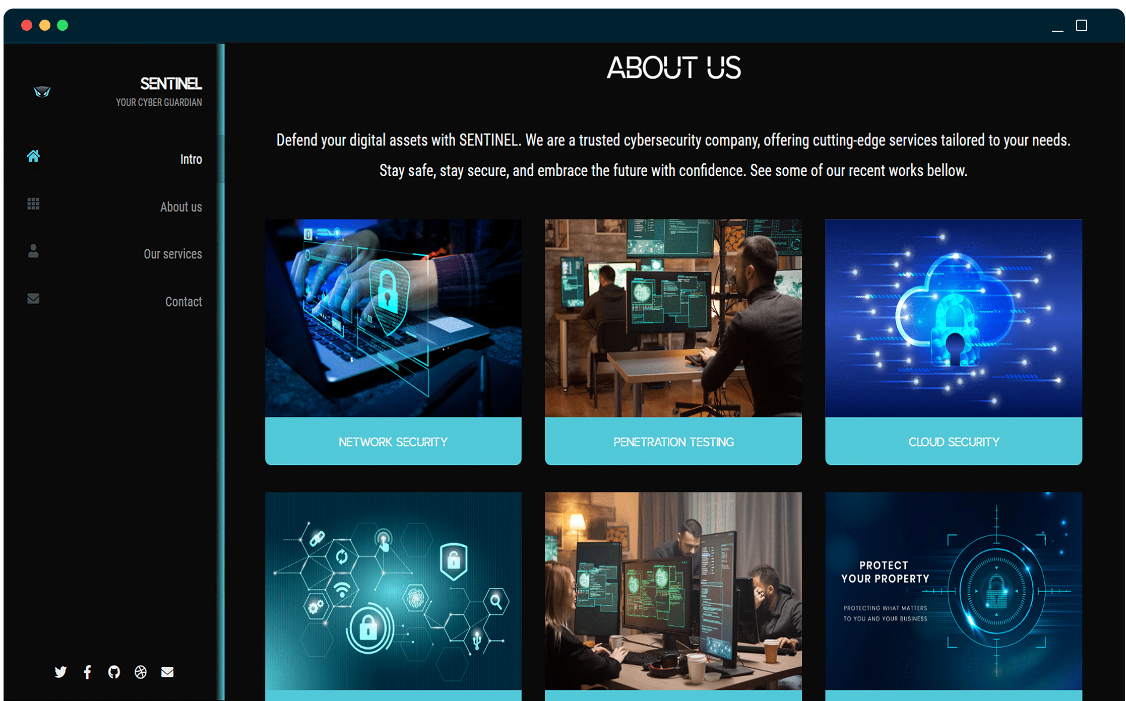
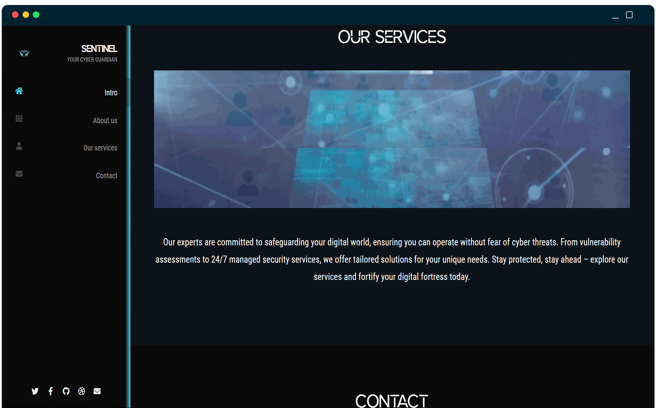
To complete the brand indentity I created a small onepage website only using html & CSS :
- Stealthy Protection: Like owl’s silent flight, The cybersecurity company operate discreetly.
- Guardians of the Night: Owls are night sentinels, and so are cybersecurity company.
- Detecting the Unseen: Owl’s acute perception parallels the threat detection.
